
Monk fruit//
Packaging / Art direction /
-
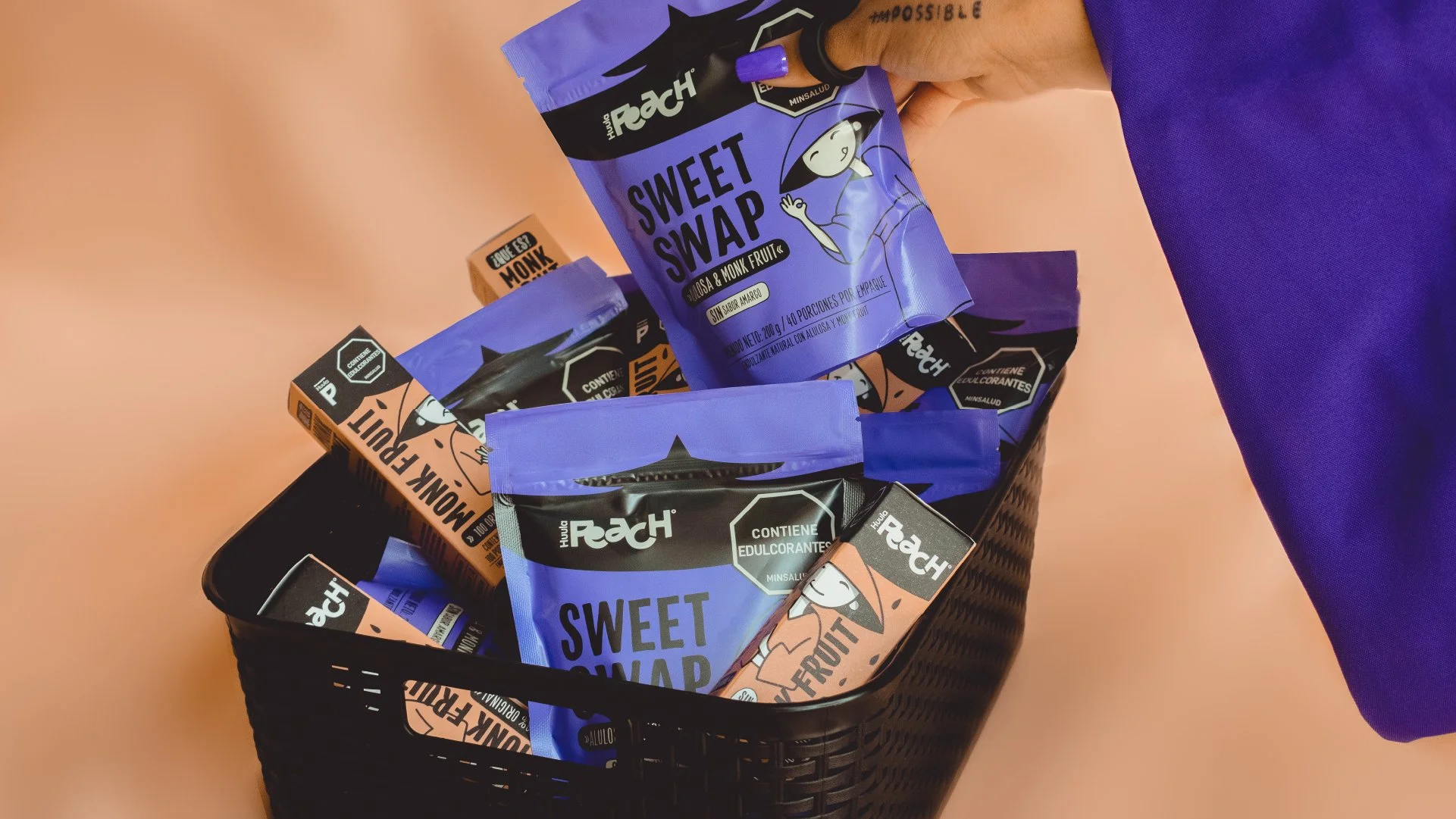
Huula Peach came back to the studio with two new products and a clear goal: “We want to stand out visually and break away from the usual wellness clichés.”
Our approach:
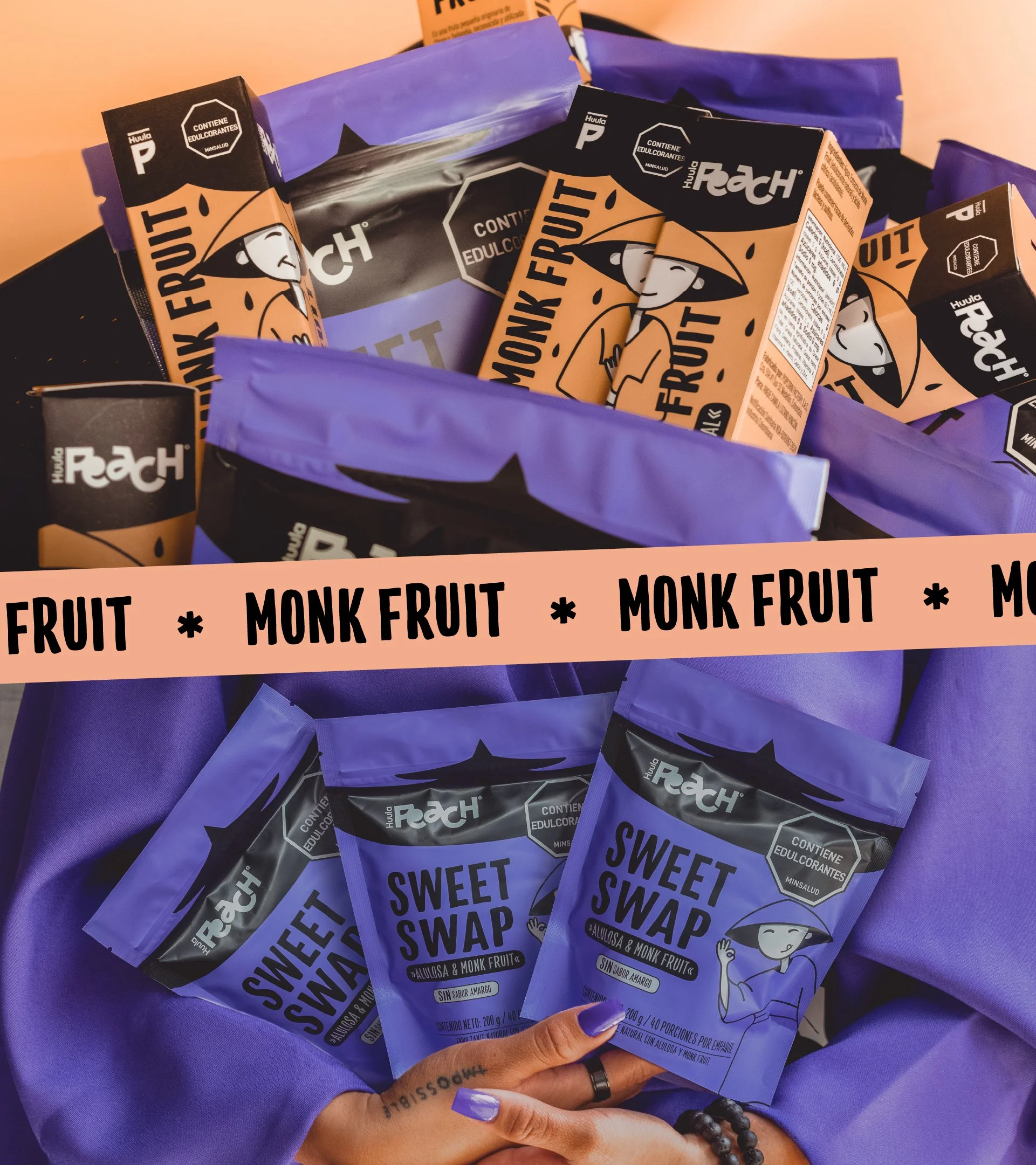
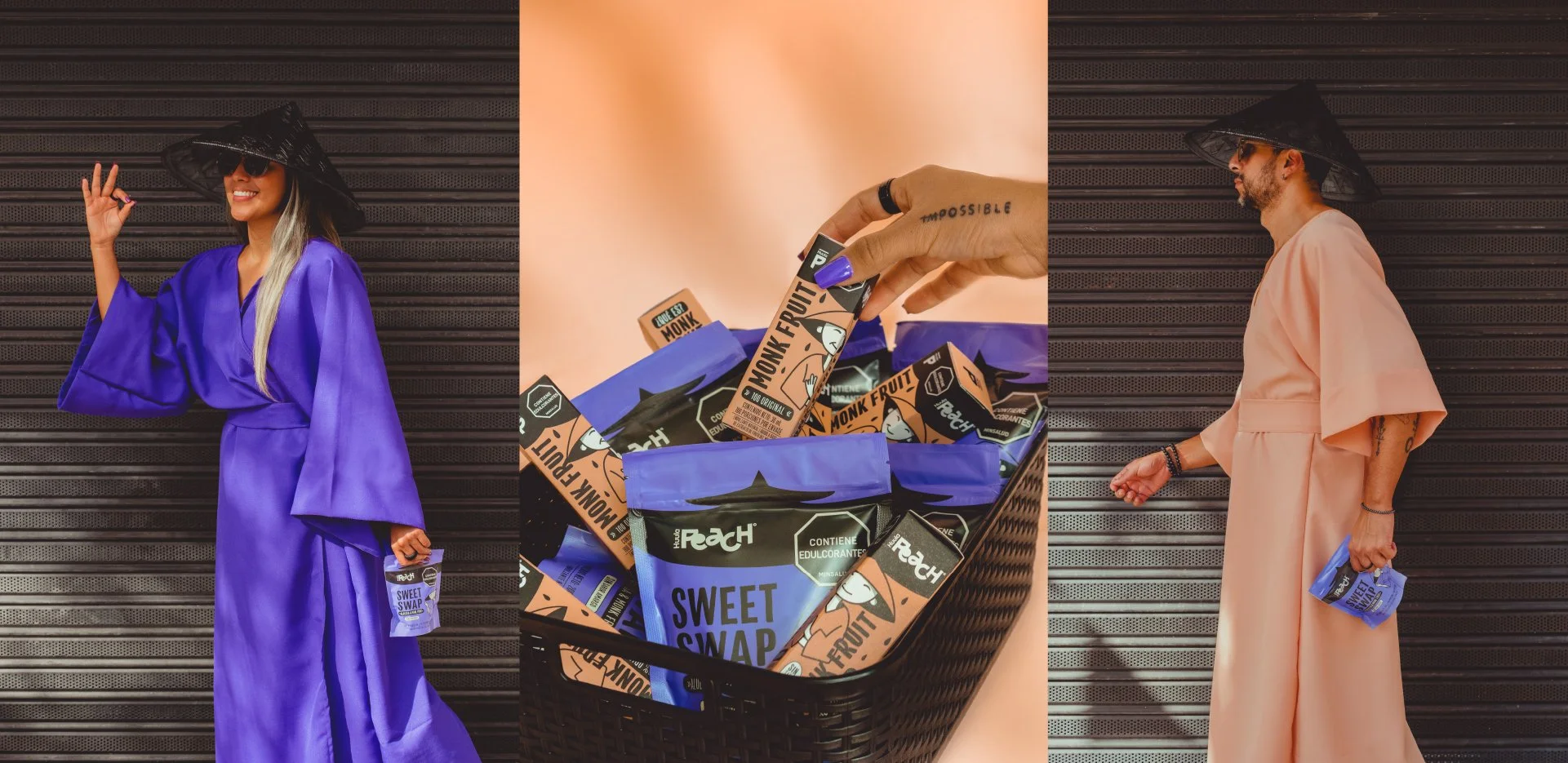
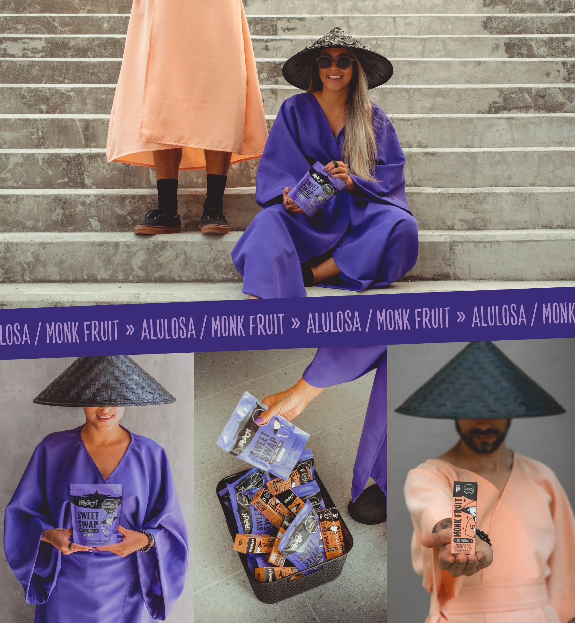
While spending a season in Thailand, one of the birthplaces of monk fruit, we immersed ourselves in its history, usage, and cultural relevance. But more importantly, we sought inspiration. That’s how Inva Joy was born: a bold and playful concept full of characters, emotions, and irreverence. It led us to create Mon, the cheerful main character inspired by the joyful simplicity of Buddhist monks.
The solution:
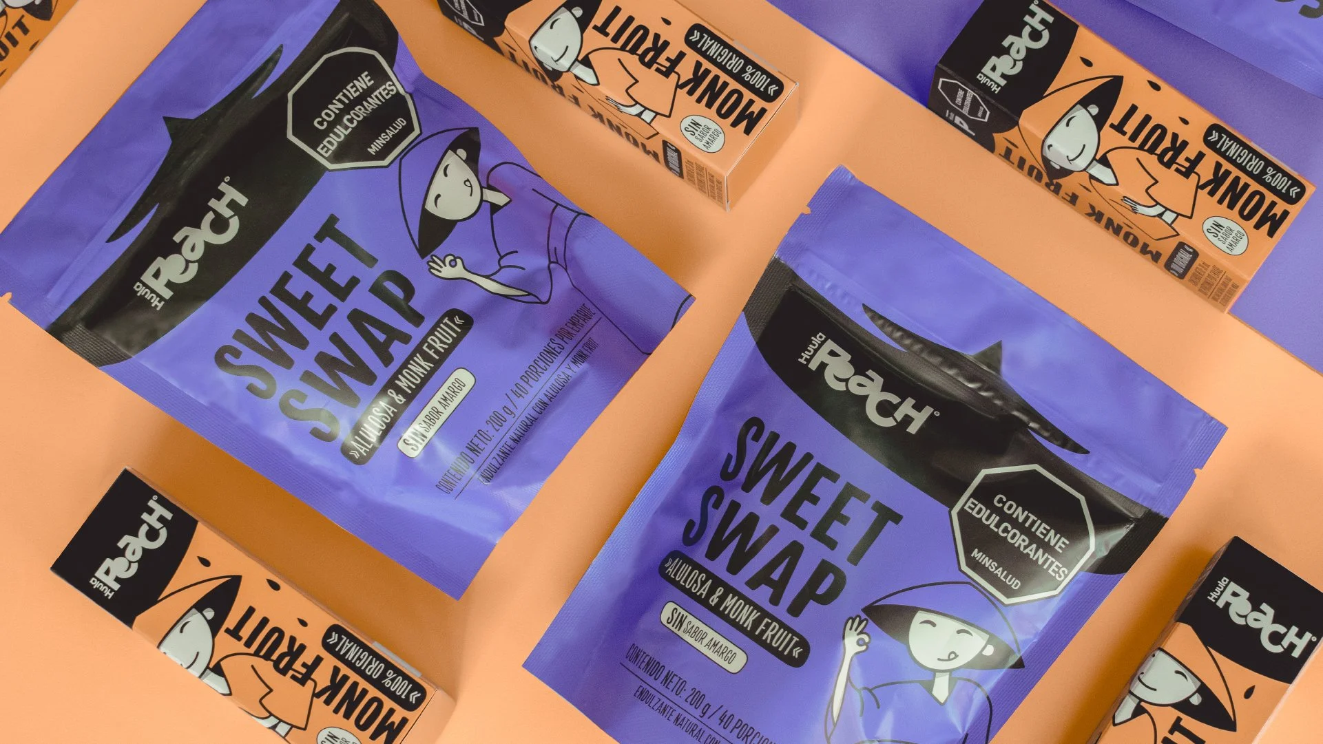
We started by shaping Mon's story, personality, and visual identity through simple, expressive strokes. We built a minimalist yet playful color palette and adapted the character to the doypack format, preserving his charm and visual impact. The typography and claims reinforced the brand’s warmth and authenticity, while a black upper area was added to seamlessly integrate legal stamps without disrupting Mon's universe.
The result:
The brand has been very well received in local health stores, standing out on the shelves not only as an innovative product but also thanks to its bold and unconventional design. It’s now gearing up to enter the country’s major retail chains this year.
-
Huula Peach vuelve al estudio, ahora con dos nuevos productos y con una necesidad muy clara: “queremos destacar visualmente y salirnos de los códigos típicos del sector wellness”.
Nuestro enfoque:
Durante nuestra temporada en Tailandia, origen del fruto del monje, investigamos a fondo su historia y consumo, pero sobre todo, buscamos inspiración. Así nació Inva Joy, un concepto lleno de personajes, emociones e irreverencia que dio vida a Mon, nuestro protagonista, inspirado en la alegría y sencillez de los monjes budistas.
La solución:
El diseño comenzó con la creación de Mon: le dimos historia, personalidad y una identidad visual con trazos simples que reflejaran su esencia. Usamos una paleta minimalista pero divertida y adaptamos el personaje al doypack, manteniendo su alegría e impacto. La tipografía y los claims reforzaron la cercanía y autenticidad, y sumamos un entorno negro en la parte superior para integrar los sellos legales sin romper la estética del universo de Mon.
Resultado final:
La marca ha sido muy bien recibida en las tiendas saludables de la ciudad, destacándose en el punto de venta, no solo por ser un producto innovador, sino también por su diseño llamativo y diferente dentro de la categoría. Se proyectan para este año entran a las grandes cadenas del país.