
Peach//
Branding / Design
-
Two girls arrived at the study with a lot of enthusiasm and energy to create a brand for a healthy market; this brand had to be young, fun (because healthy doesn't have to be boring) and above all, very natural.
We started working from the streets, conducting a local and regional research that gave us the guidelines to begin.
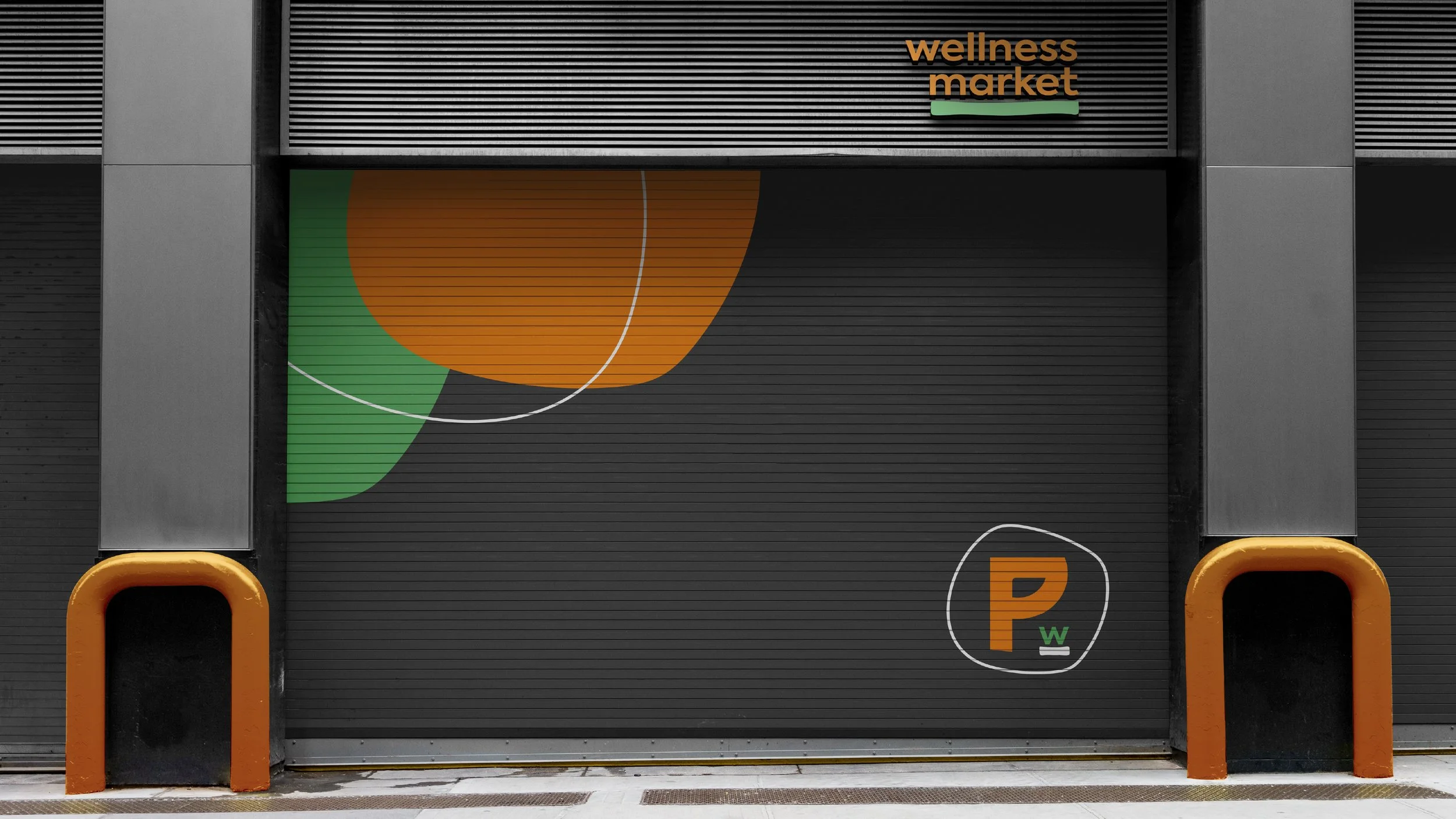
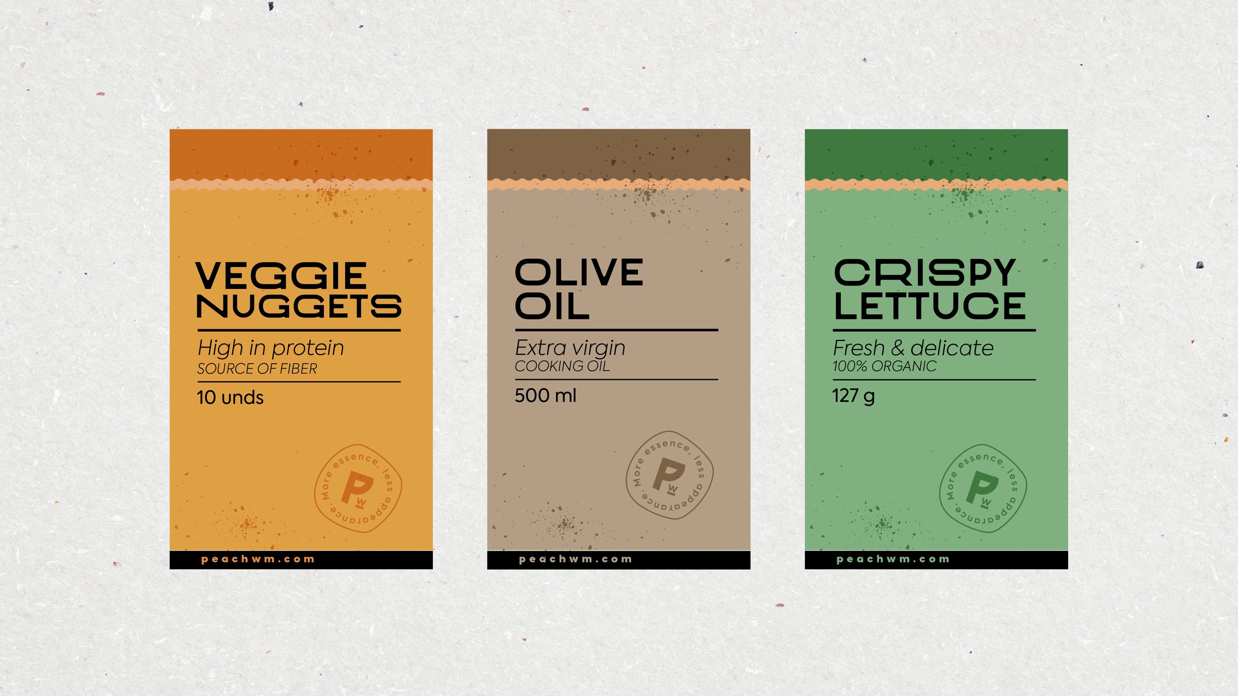
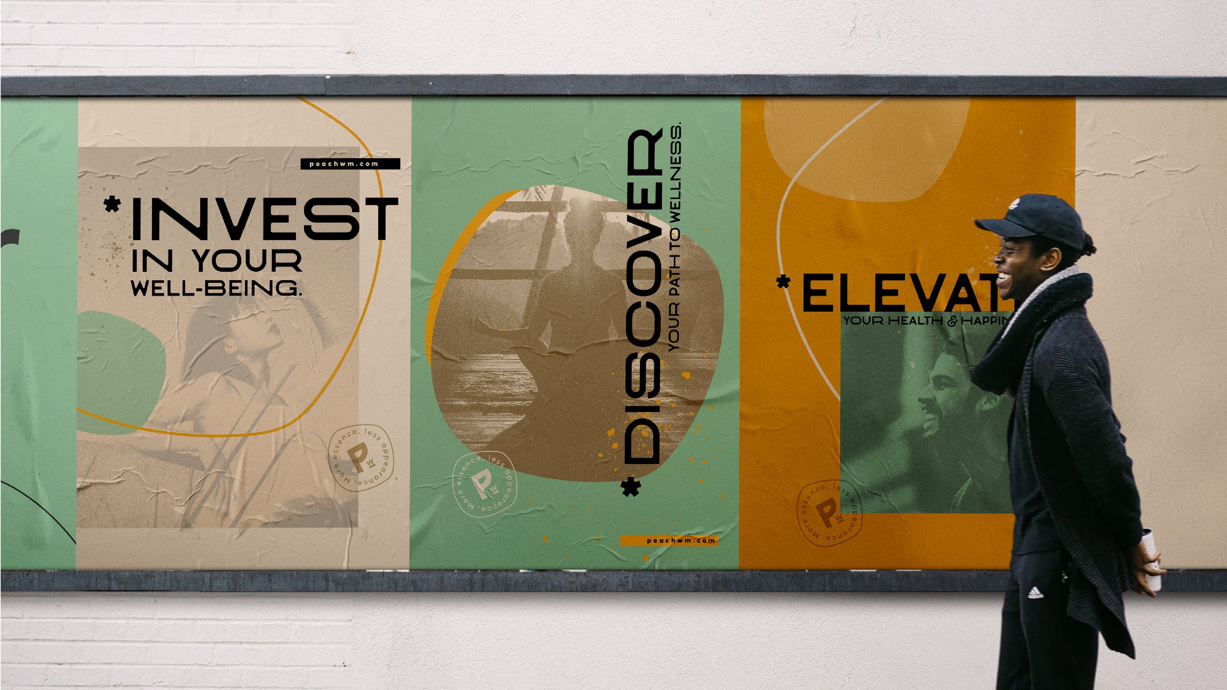
The logo was built from a typographic join that reflected the connection between the store and the consumer; the color palette allowed us to look fresh, cool, and confident.
The abstract shape in the logo symbol is a peach in its minimal expression, and the graphic system continued the dynamic with organic contours.
-
A nuestro estudio llegaron 2 chicas con toda la onda y muchas ganas de crear una marca para un mercado saludable; esta marca, debía ser joven, divertida (porque lo saludable no es aburrido) y sobre todo, muy natural.
Comenzamos a trabajar desde las calles, haciendo una salida de campo local y regional, la cual nos dio las pautas para iniciar.
El logotipo se construyó a partir de uniones tipográficas que transmitían la conexión entre la tienda y el consumidor; la paleta de colores nos permitía vernos frescos, cool y seguros.
La forma abstracta en el logo-símbolo es un durazno en su mínima expresión y el sistema gráfico continuó la dinámica con contornos orgánicos.