
Bangkok Theatre Project//
Branding / Graphic system / Visual identity
-
Bangkok Theatre Project is building a world-class children's theatre scene in Bangkok, Thailand. When we started working on this project, one challenge stood out right away: how do you make a long name feel light, fun, and impossible to ignore?
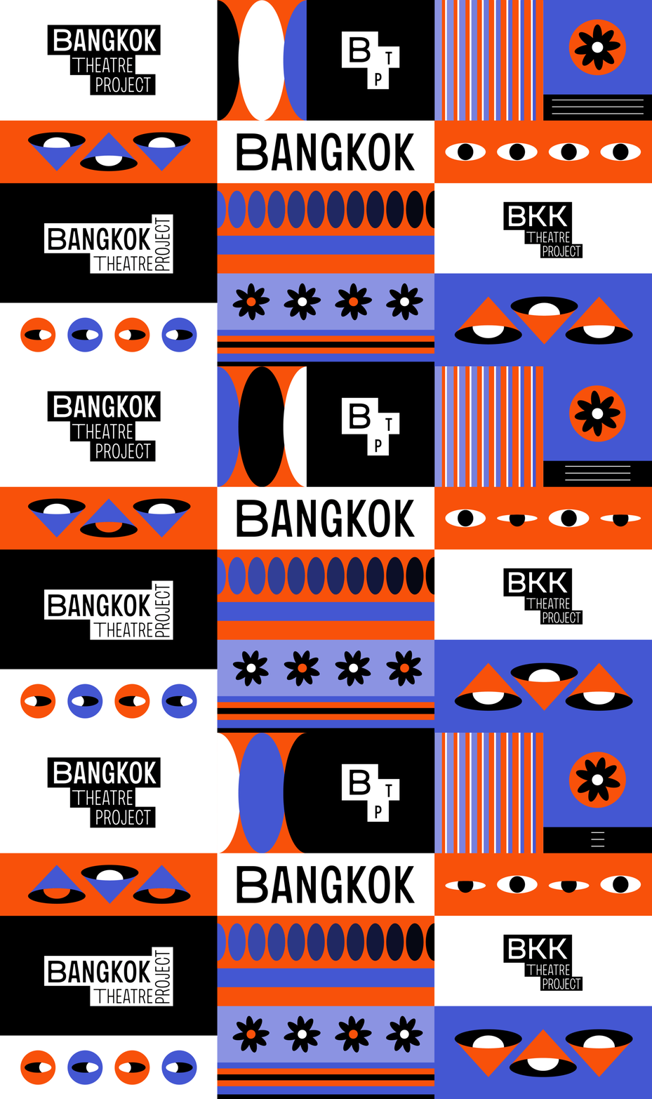
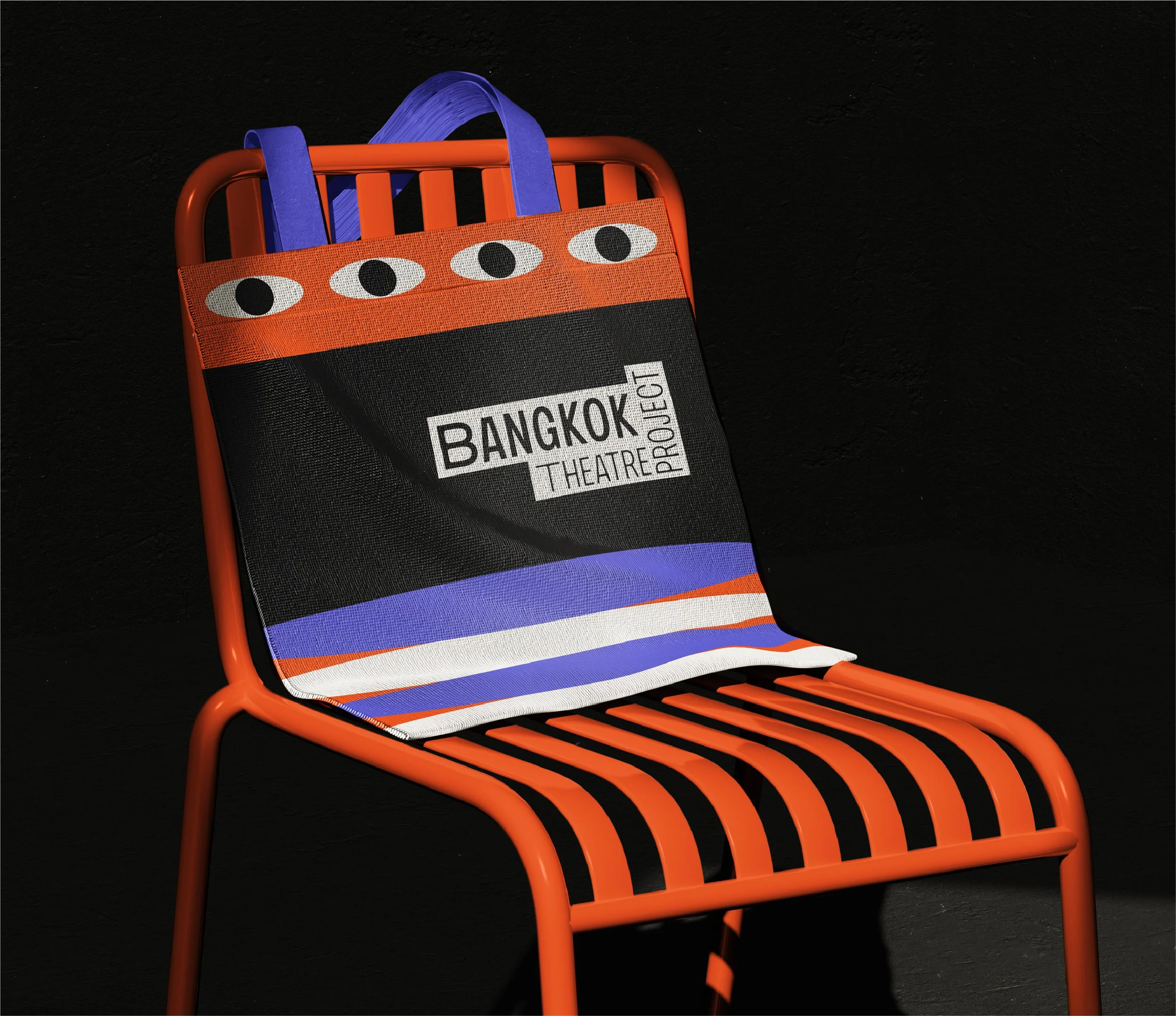
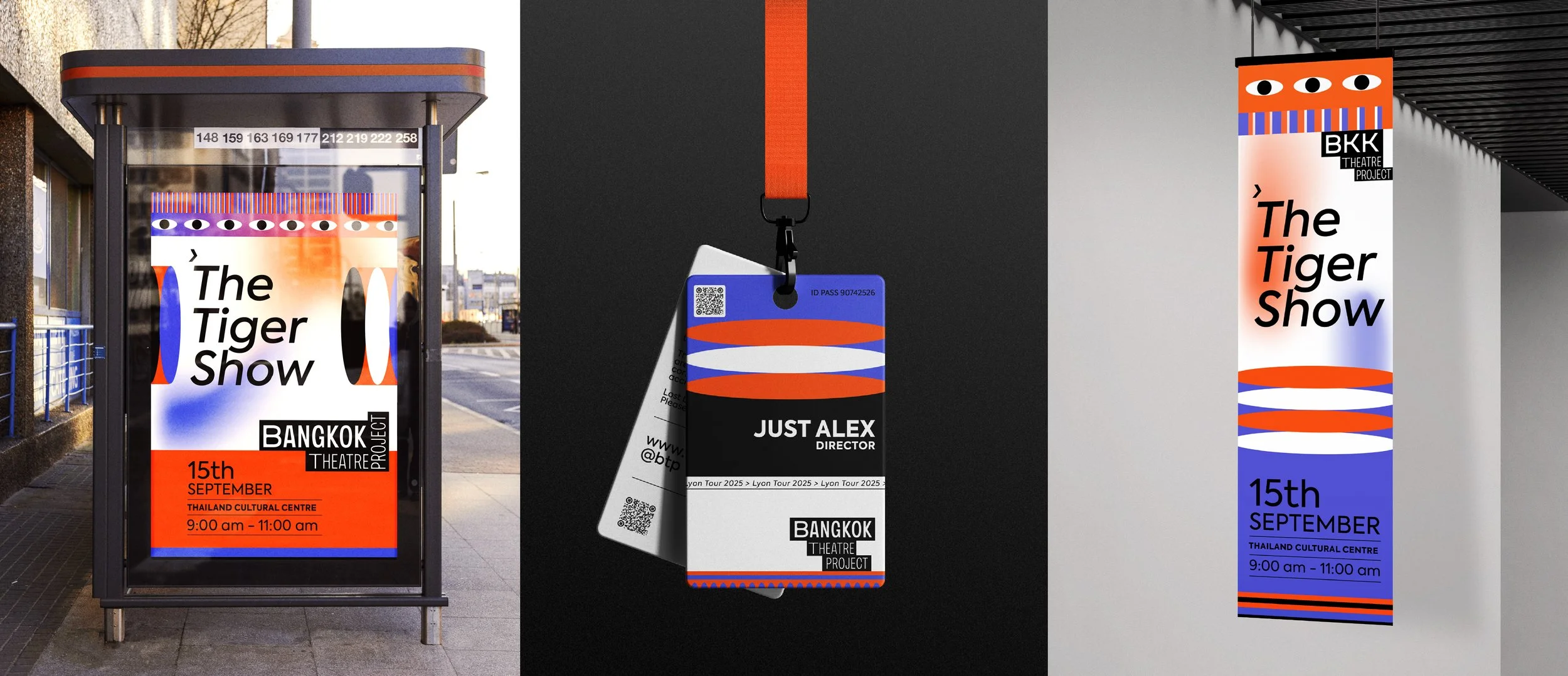
It's a formal name, a long one, hard to compress into a single mark without losing their essence. So instead of shrinking it, we set it in motion. The identity is built on a modular block system (black tiles carrying white type) that rearrange depending on where they land: stacked, horizontal, spelled out in full, or trimmed down. The logo was never meant to be fixed; it's choreography. Same letters, different arrangements, always legible, always playful.
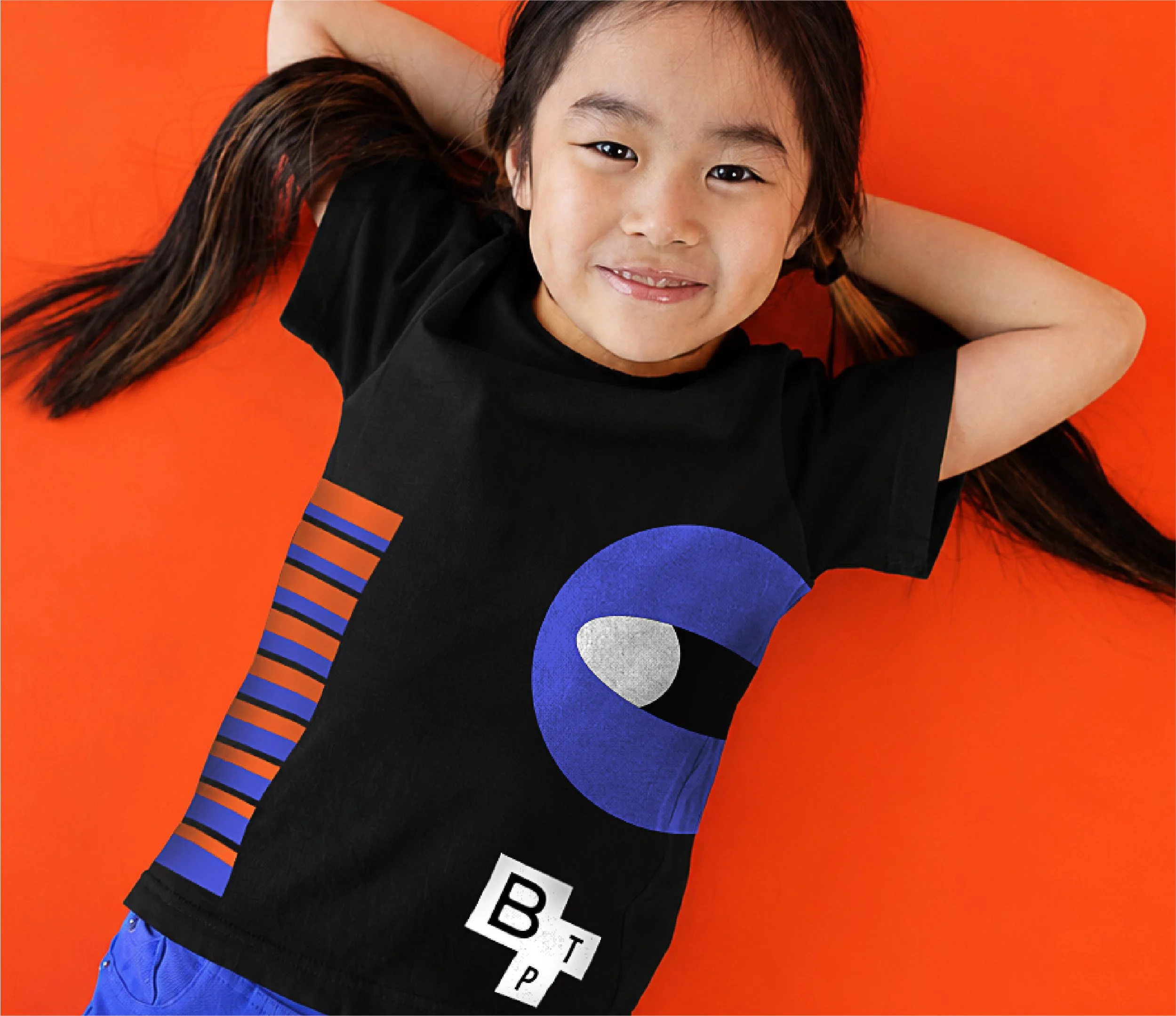
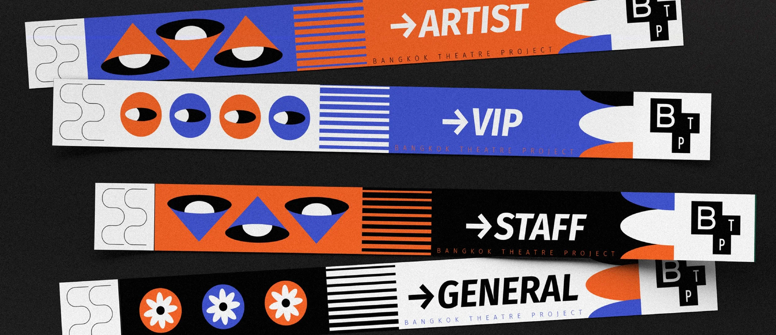
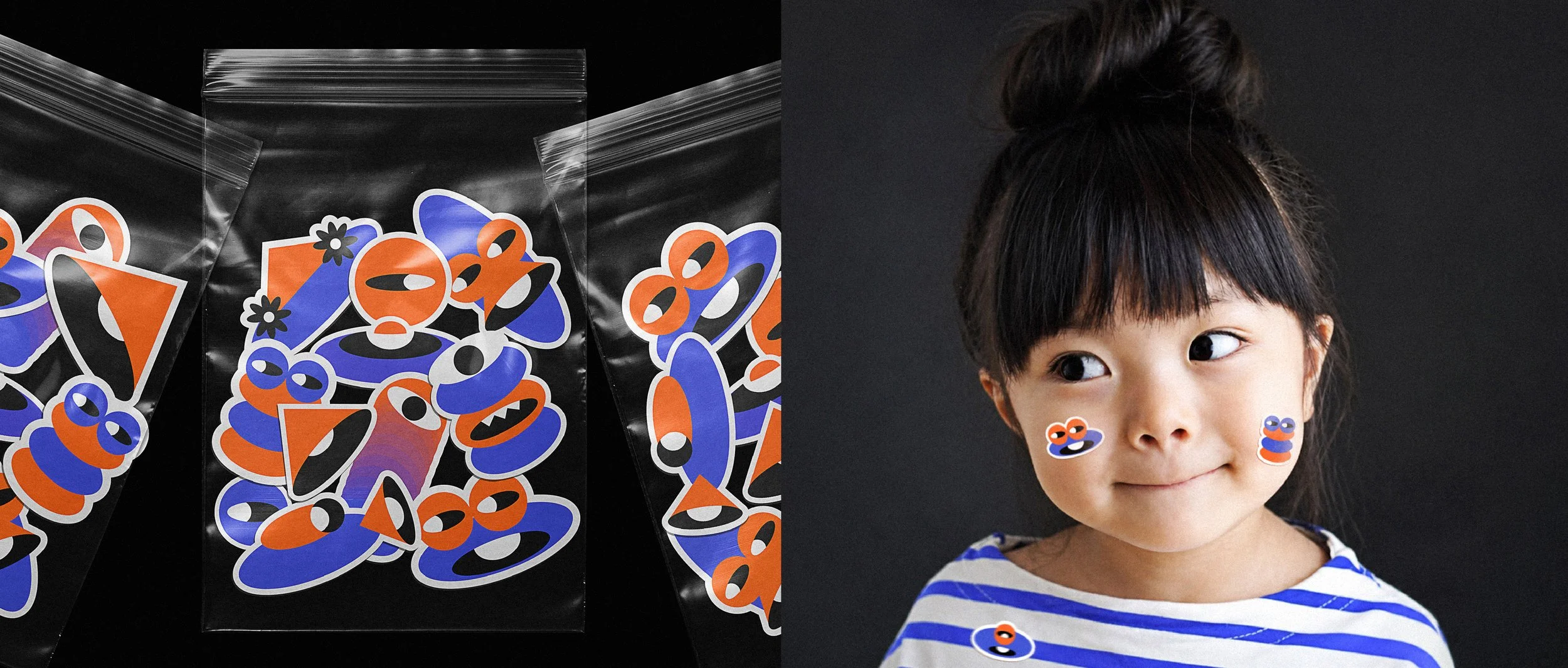
That same idea, pieces that recompose themselves, runs through the entire visual system. Nothing in this brand was allowed to sit still. We started with basic shapes (circles, ovals, triangles) tapping into that instinct for play that comes so naturally to kids, and let them grow into a world of endless possibility: light, script, characters, movement, all seen through a child's eyes. A brand that's dynamic by construction, not just by looks.
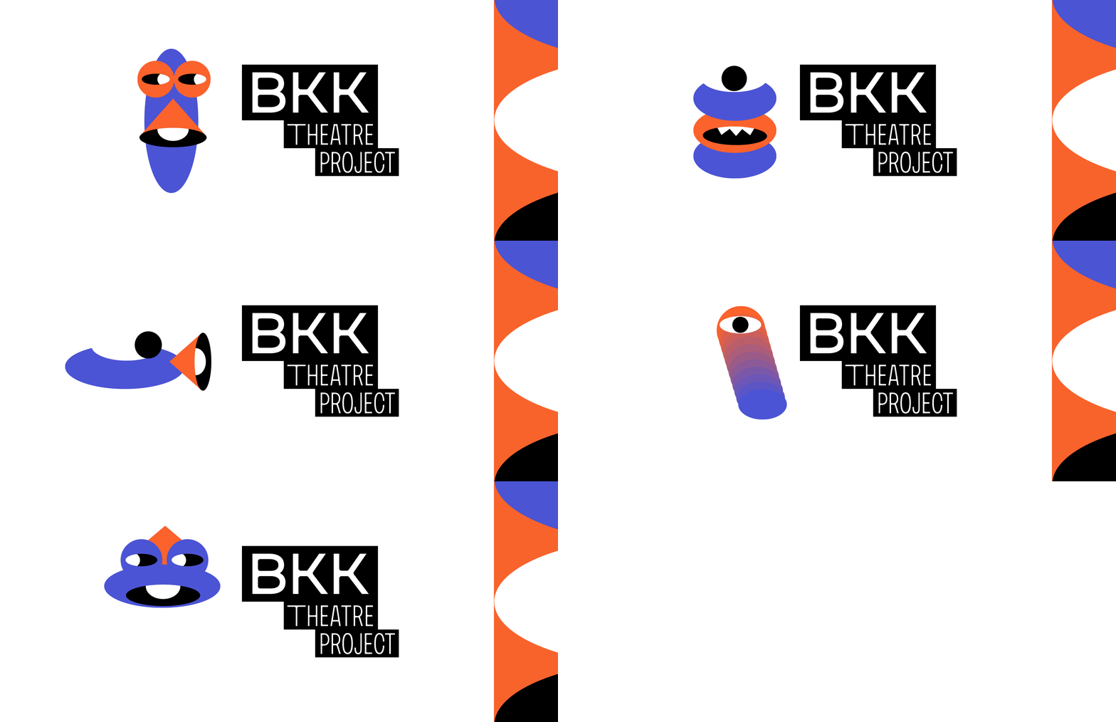
That's where an entire family of characters came from (cyclopes, birds, little monsters) and we spent a good part of the process on them. The goal was to build every single one from that same closed set of shapes already defining the system. The real surprise was realizing it wasn't a limited system at all, it opened up as many possibilities as a child's imagination could dream up. Every character shares one gesture: a wide, open eye, the look of wonder kids get when they see the world for the very first time.
The high-contrast color palette followed the same logic: movement, surprise, wonder. Blue and orange don't belong to the same family, and that's the point — one is the dim hush before the curtain rises, the other is the light that switches on the moment the show begins. Black holds it all together, and white leaves it ready for curtain call. It's a palette built to contrast, the way a good show does: bold enough to read at a glance, versatile enough for any age.
The result is a system that's equal parts structure and surprise: a rigid modular grid underneath, total visual freedom on top. Built not to dress a single show, but to keep dreaming up whatever comes next.
-
Bangkok Theatre Project impulsa la escena de teatro infantil de talla mundial en Bangkok, Tailandia. Cuando comenzamos a trabajar en este proyecto, entendimos que nuestro primer reto era claro: cómo hacer que un nombre largo se sintiera ligero, divertido y de alto impacto.
Es un nombre formal, extenso, difícil de comprimir en una sola marca sin perder su esencia. En vez de reducirlo, lo pusimos en movimiento. La identidad se construye sobre un sistema modular de bloques (fichas negras que sostienen tipografía blanca) que se reorganizan según el lugar que ocupan: apiladas, horizontales, completas o reducidas. El logotipo no es fijo; es una coreografía. Las mismas letras, distintas configuraciones, siempre legibles, siempre juguetonas.
Ese mismo principio de fichas que se recomponen es el que rige todo el sistema visual: nada en esta marca debía quedarse quieto. Partimos de formas básicas (círculos, óvalos, triángulos) integrando esa relación primaria de juego que tienen los niños, y las dejamos transformarse en un mundo de posibilidades infinitas, capaz de recrear luces, guiones, personajes y movimiento, todo visto desde la mirada de un niño. Una marca dinámica por construcción, no por estética.
De ahí nació una familia extensa de personajes (cíclopes, aves, pequeños monstruos) a los que dedicamos buena parte del proceso. La idea era construirlos enteramente a partir del mismo conjunto cerrado de formas que ya definía el sistema. La gran sorpresa fue comprobar que no era un sistema limitado, sino que, por el contrario, ofrecía tantas posibilidades de personajes como lo permitiera la imaginación de un niño.
Estos personajes comparten un mismo gesto: un ojo abierto y amplio, la mirada del asombro con que los niños ven el mundo por primera vez.La armonía de color de alto contraste se eligió con esa misma lógica: el movimiento, lo inesperado, el asombro. Azul y naranja no comparten familia, y esa es la idea: uno es la penumbra antes de que suba el telón, el otro es la luz que enciende la escena en cuanto empieza la función. El negro los sostiene como estructura, y el blanco lo deja listo para la función. Es una paleta que contrasta como lo hace un buen montaje: potente para leerse de un vistazo, y versátil para cualquier edad.
El resultado es un sistema que es, en partes iguales, estructura y sorpresa: una retícula modular rígida por debajo, libertad visual total por encima. Construido no para vestir un solo montaje, sino para seguir soñando con los que vengan después.