
Mar Amar//
Brand essence / Branding / Graphic system / Art direction /
-
Mar Amar begins with the challenge of finding its brand essence, and through different tools, we gradually discovered every opportunity, dream, and projection of the brand; the answers to what, how, why, and the values of Mar Amar were part of that construction, and after weeks of hard work, living in its environment and interviewing its partners, clients, and collaborators, the essence began to come to us.
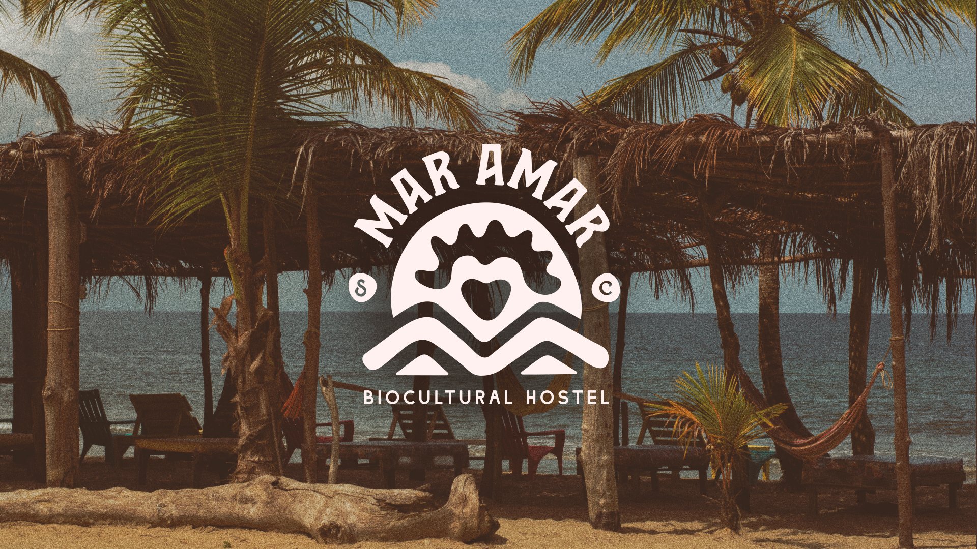
CONNECTION, that was its essence, connection with nature, with culture, with tradition, and above all with people. The work didn't end there, but we were giving a face to that personality, to the soul that was already defined through the logo, a symbol that merges mountains and waves in a pre-Colombian form, illuminated by a sunset sun embracing a heart, symbolizing the passion for culture and carnivals.
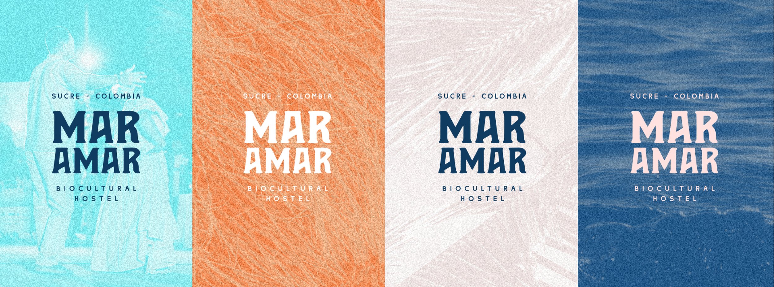
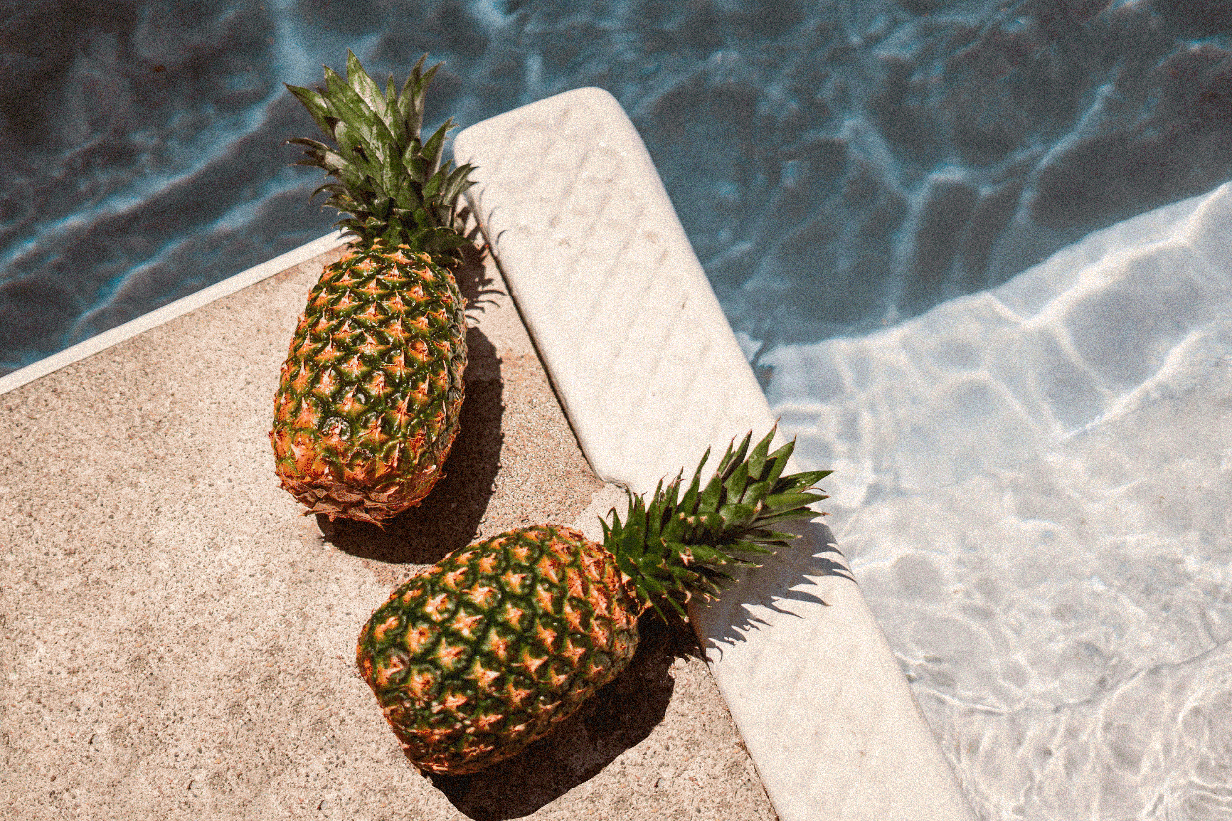
The dynamic and cheerful typography of Mar Amar reflects the authenticity of the place, with organic finishes that immerse us in the surrounding nature. The colours orange, blue, and beige evoke the warmth of the Caribbean, the depth of the sea, and the softness of the sand.
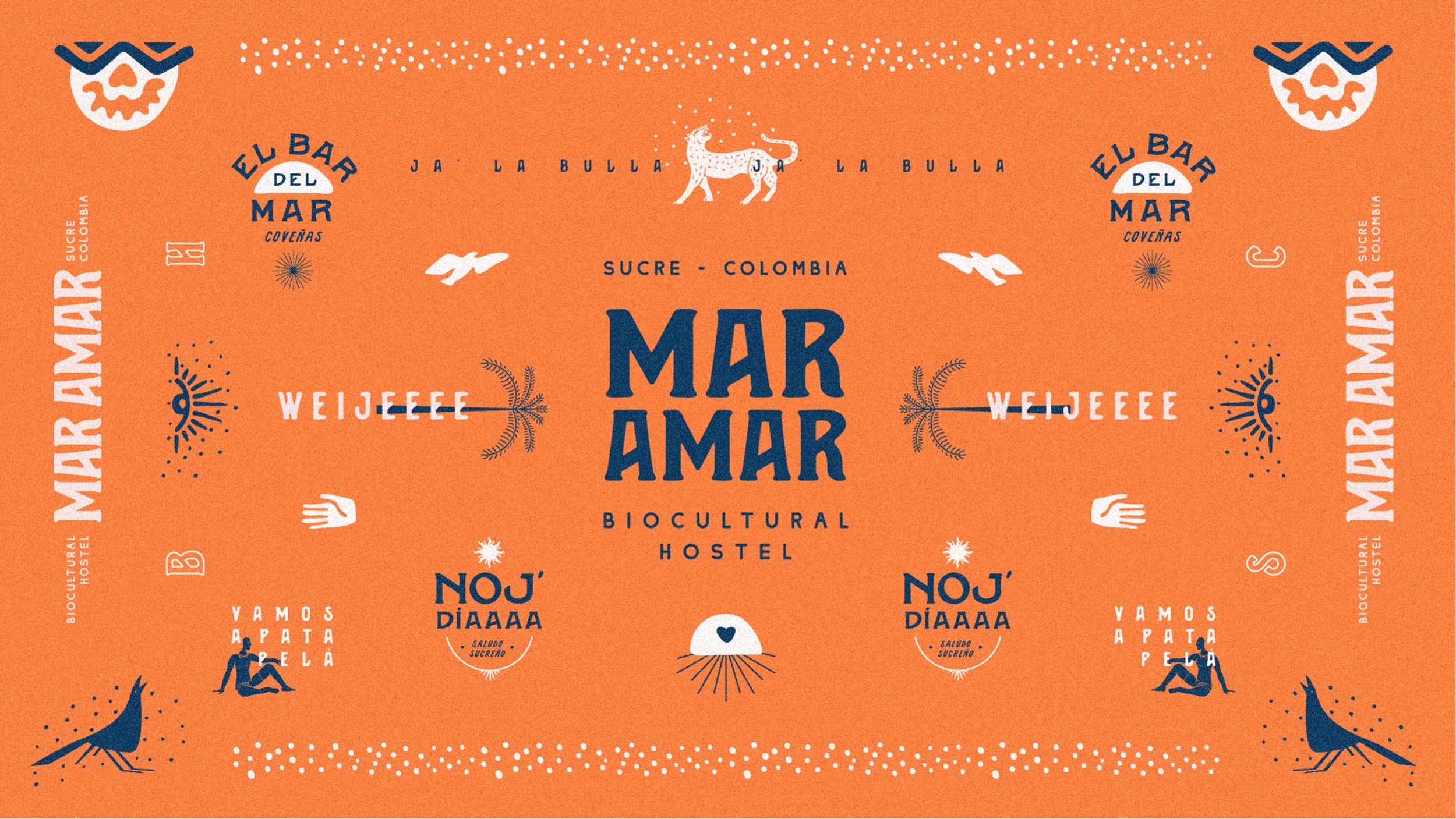
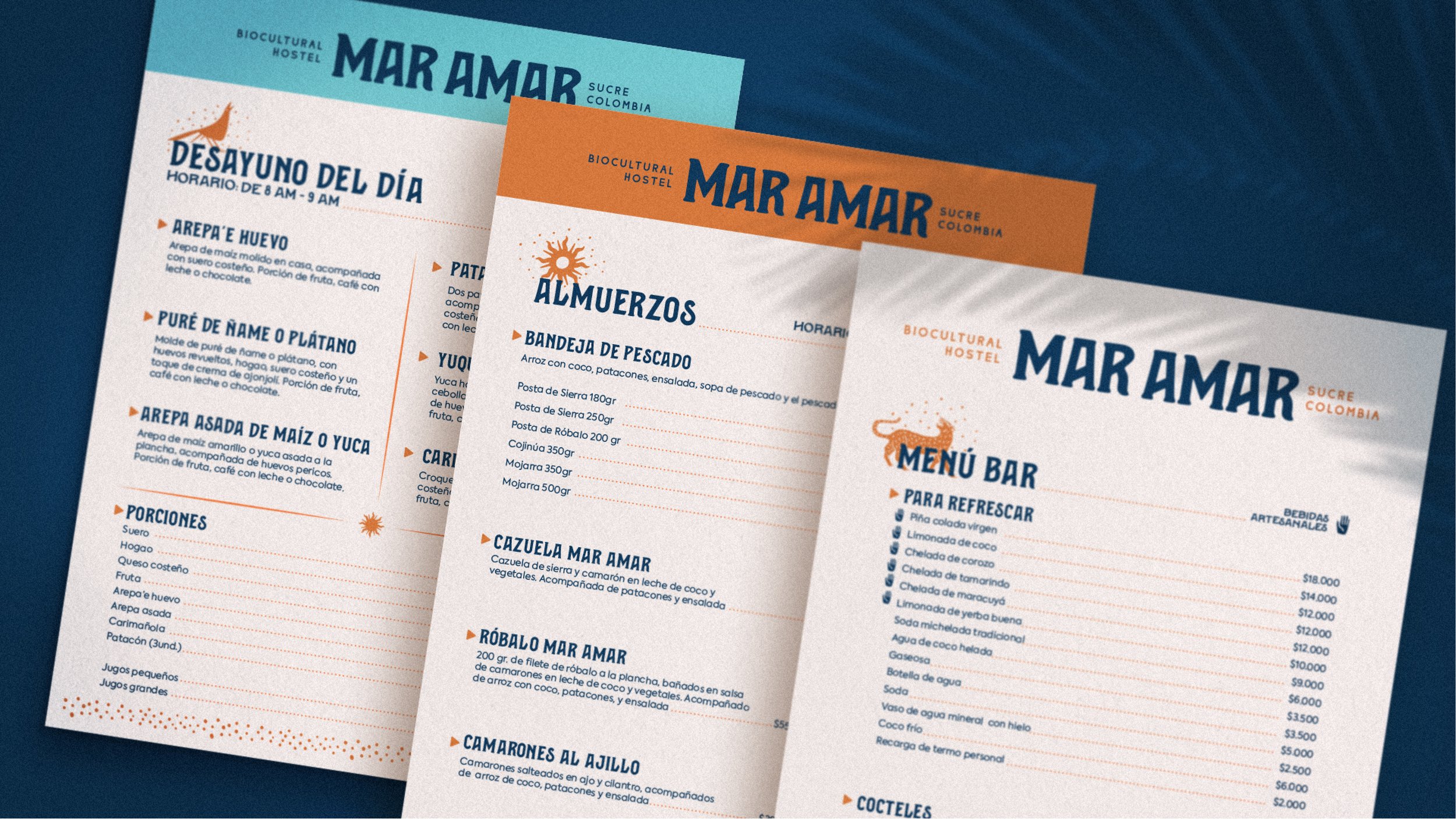
In this creative journey, we have woven a graphic system that embraces its essence. From uniforms reflecting joy to a menu celebrating biodiversity and native cuisine, every detail tells a story. Merchandising, with alternative logos and illustrations, becomes an echo of cultural connection.
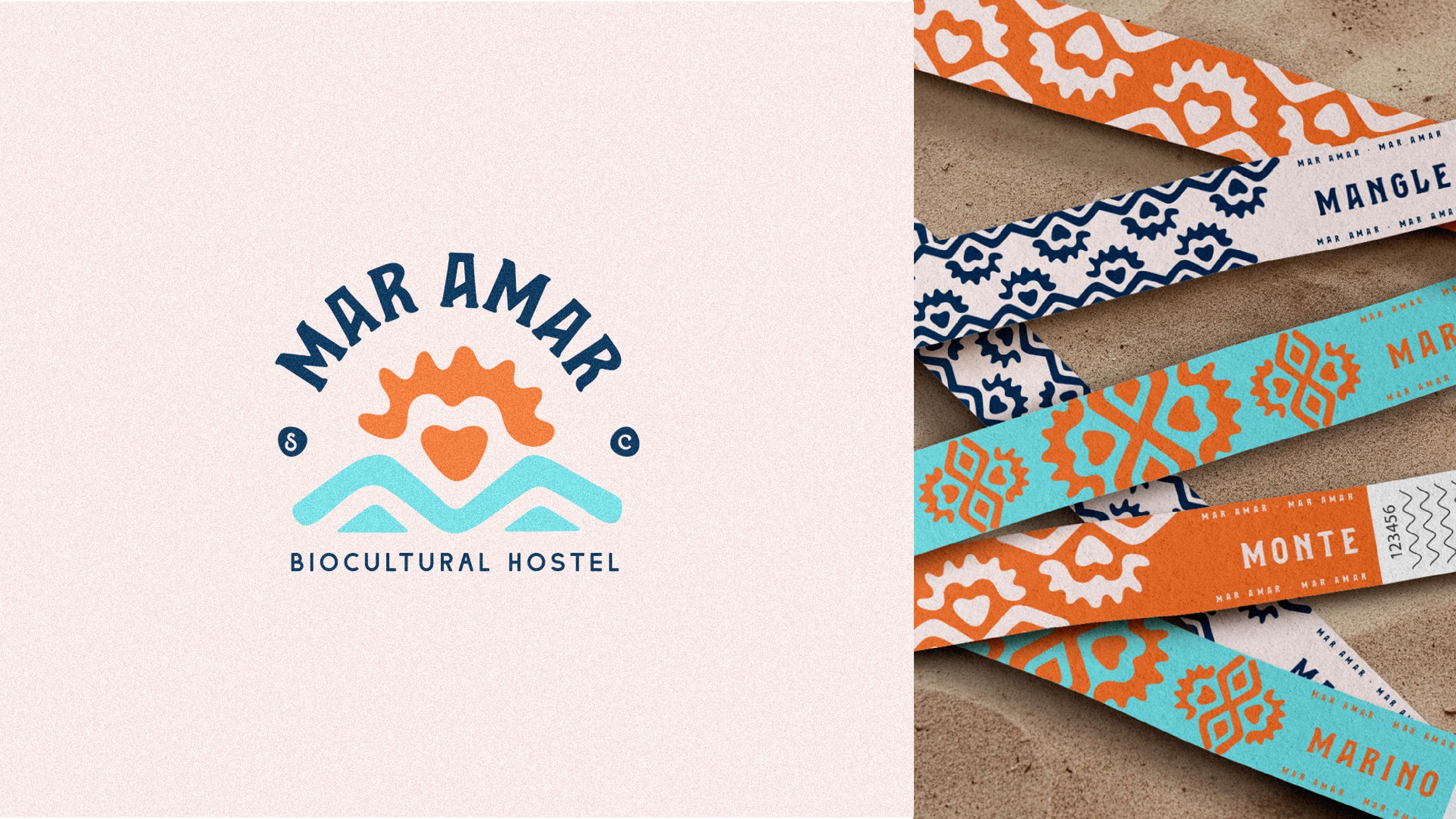
The signage guides guests with a coherent dialogue with the brand and its tone of voice, and in every corner, our pieces tell the story of a place proud of its roots and embracing diversity.
-
Mar amar inicia con el reto de encontrar su esencia de marca y por medio de diferentes herramientas, fuimos encontrando cada oportunidad, sueño y proyección de la marca; las respuestas al qué, al cómo, al porqué y a los valores de Mar Amar eran parte de esa construcción y después de semanas de trabajo duro, conviviendo en su entorno y entrevistando a sus socios, clientes y colaboradores la esencia fue llegando a nosotros.
CONEXIÓN, esa era su esencia, conexión con la naturaleza, con la cultura, con la tradición y sobre todo con las personas. El trabajo no terminó ahí, sino que fuimos dándole una cara a esa personalidad, al alma que ya estaba definida a través del logo, un símbolo que fusiona montañas y olas en una forma precolombina, iluminado por un sol al atardecer que abraza un corazón, simbolizando la pasión por la cultura y los carnavales.
La tipografía dinámica y alegre de Mar Amar refleja la autenticidad del lugar, con acabados orgánicos que nos sumergen en la naturaleza circundante. Los colores naranja, azul y beige evocan la calidez del caribe, la profundidad del mar y la suavidad de la arena.
En este viaje creativo, hemos tejido un sistema gráfico que abraza su esencia. Desde uniformes que reflejan la alegría, hasta un menú que celebra la biodiversidad y la gastronomía nativa, cada detalle cuenta una historia. El merchandising, con logos alternativos e ilustraciones, se convierte en un eco de la conexión cultural.
La señalización guía a los huéspedes con un diálogo coherente con la marca y su tono de voz y, en cada rincón, nuestras piezas cuentan la historia de un lugar que se enorgullece de sus raíces y abraza la diversidad.